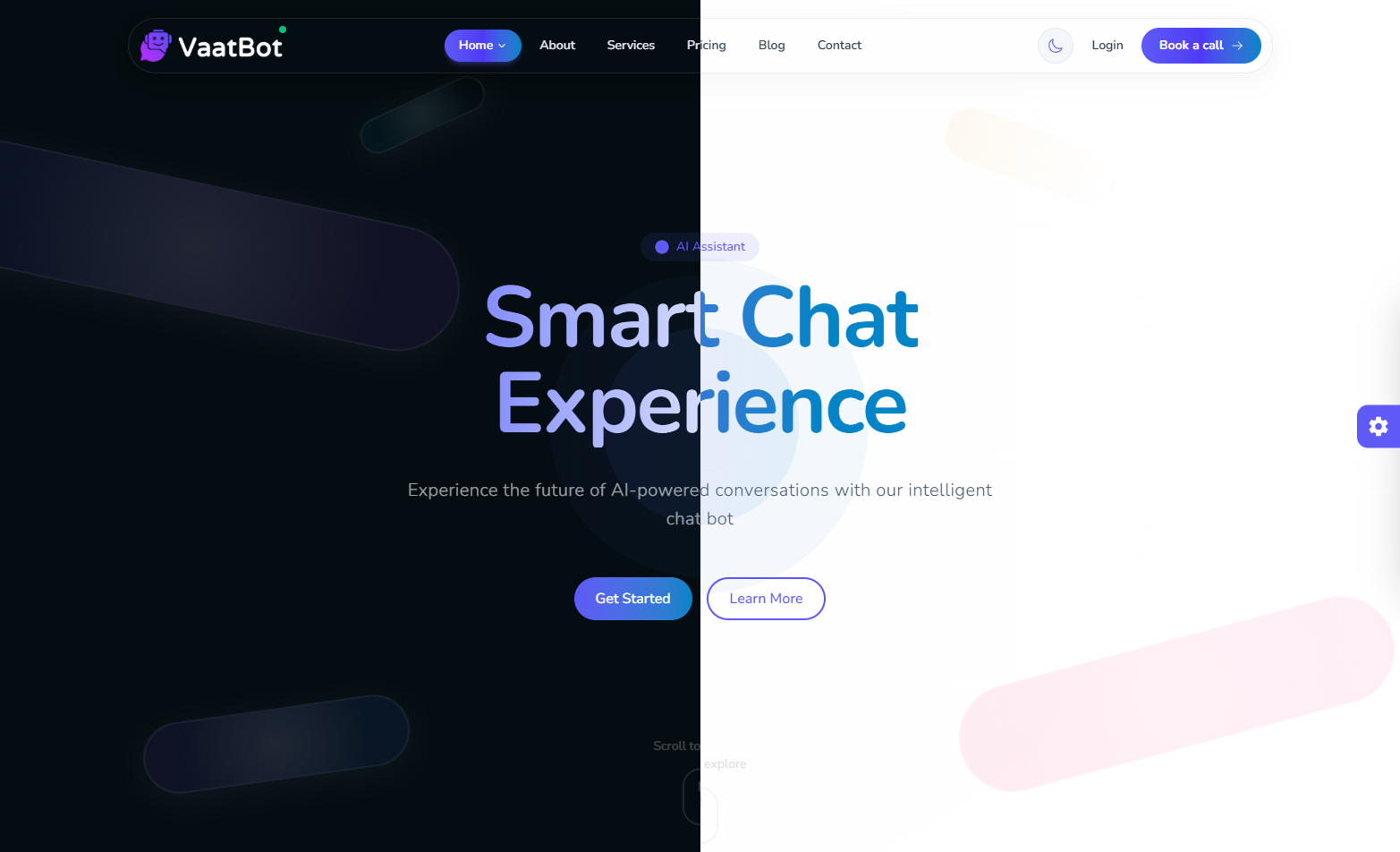
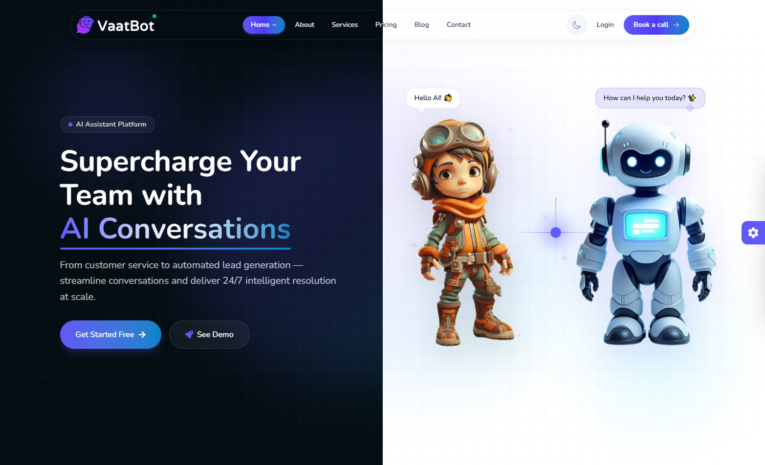
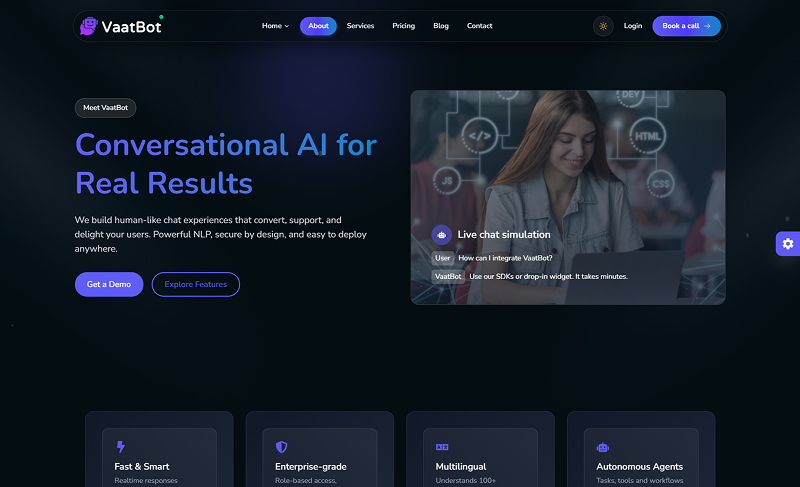
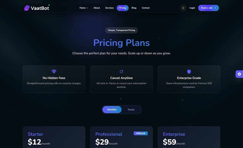
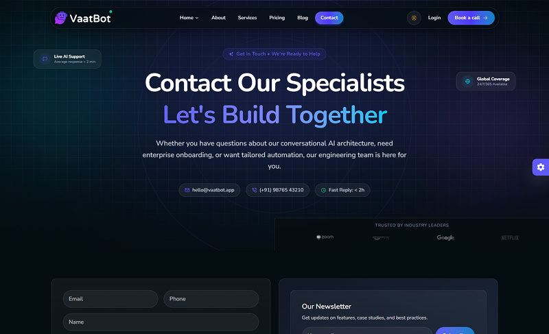
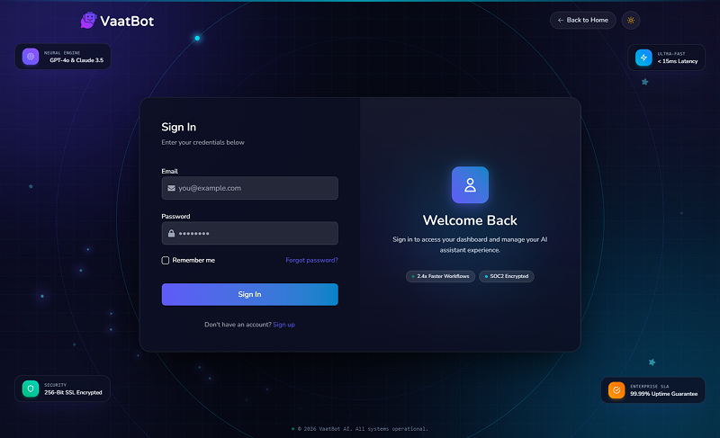
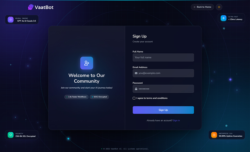
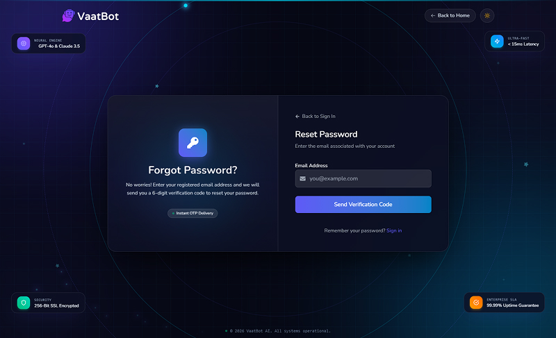
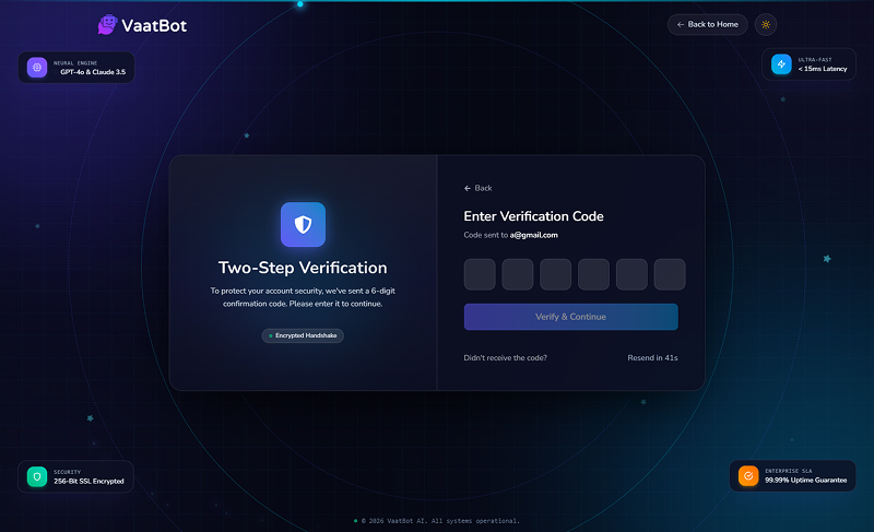
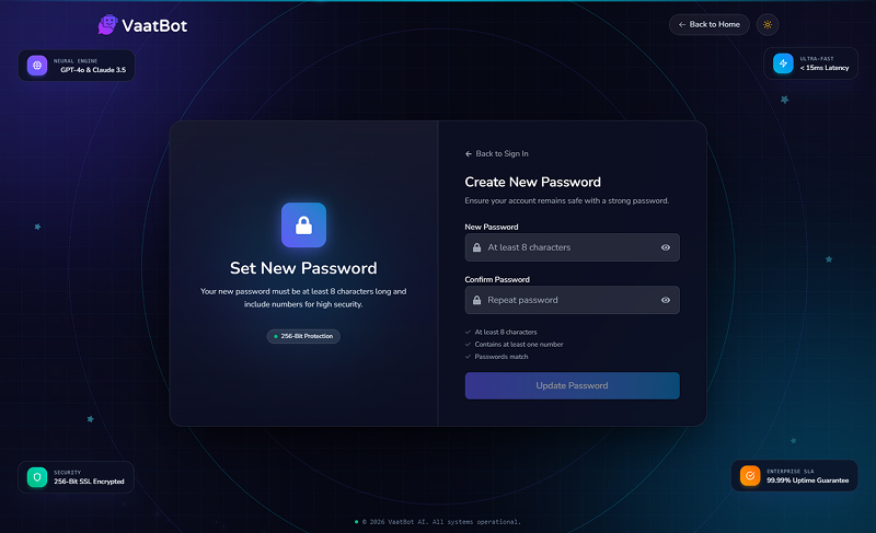
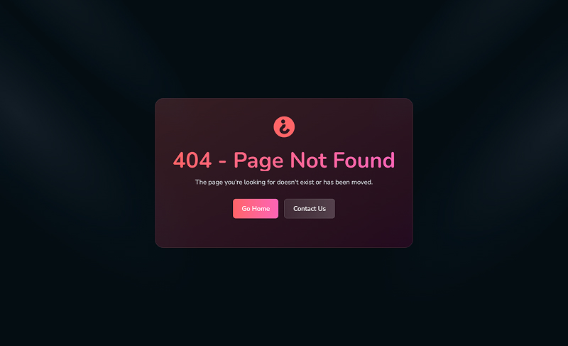
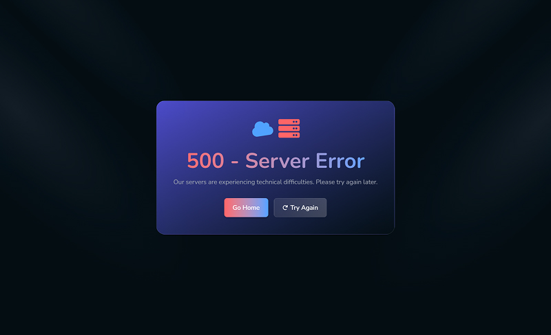
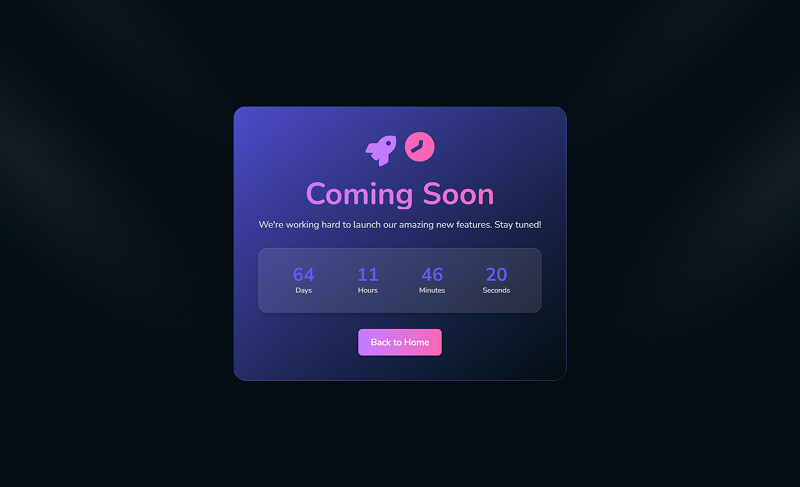
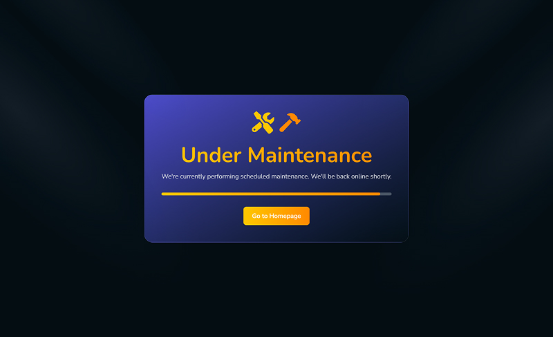
A modern, developer-first React & Tailwind CSS 4 UI kit engineered for AI startups, chatbots, and SaaS platforms. Featuring 4+ unique home demos, 15+ pre-built pages, newly added 3-step authentication flows, dark & light modes, and full RTL layout support.
Preview our pages and access documentation
Explore our Comprehensive AI Chatbot Platform
Explore our comprehensive chatbot platform
Standard License – Use this item in one end product for personal or business projects and client work.
Unlimited Projects Add-on – Allows use of this item in an unlimited number of end products and client projects.
Commercial Add-on – Allows the end products to be sold or offered with subscription or paid access.
VaatBot is a modern AI chatbot platform. Built with React.js and Tailwind CSS, it features beautiful UI and responsive design, ensuring a great experience for users.
Many Hero Section Design with different layouts
Detailed pricing and subscription options
Detailed blog and discussion listings
Source Files/
├── documentation/
├── public/
│ ├── images/
│ │ ├── logo/
│ │ └── user/
│ └── favicon.ico
├── src/
│ ├── components/
│ │ ├── home/
│ │ └── ui/
│ ├── context/
│ ├── data/
│ ├── hooks/
│ ├── layout/
│ ├── lib/
│ ├── pages/
│ ├── router/
│ ├── App.jsx
│ ├── index.css
│ └── main.jsx
├── CHANGELOG.md
├── eslint.config.js
├── index.html
├── package.json
├── package-lock.json
├── README.md
└── vite.config.js
Contains all static assets including logos, avatars, illustrations, and background graphics.
Modular React components divided into home/ (landing sections) and ui/ (animated controls & widgets).
React context providers managing Light/Dark modes, RTL layout direction, and dynamic color customization.
Houses mockdata.json supplying dummy data for pricing tiers, features, blogs, FAQs, and testimonials.
Core shell architecture including floating glass Navbar, responsive Footer, 3D AI Loader, and Layout wrapper.
Top-level page views including 4 unique Home demos, 4 Authentication screens, and 15+ modern inner pages.
Application route mappings and navigation architecture defined inside RoutesPath.jsx using React Router v7.
Custom hooks like useScrollToTop and utility helpers like utils.js (Tailwind merge & clsx).
npm install
npm run dev
Here are the key dependencies and their versions used in this project:
| Package | Version | Description |
|---|---|---|
@react-three/drei |
^10.7.6 | Useful helpers for react-three-fiber |
@react-three/fiber |
^9.3.0 | A React renderer for Three.js |
@tailwindcss/vite |
^4.3.3 | Tailwind CSS plugin for Vite |
clsx |
^2.1.1 | A tiny utility for constructing className strings conditionally |
gsap |
^3.15.0 | Professional-grade animation library for JavaScript |
motion |
^12.40.0 | Animation library for the web |
react |
^19.3.1 | Core React library for building user interfaces |
react-dom |
^19.3.1 | React DOM rendering for web applications |
react-icons |
^5.7.0 | SVG icons for React projects |
react-router-dom |
^7.18.4 | Routing library for React applications |
swiper |
^11.2.10 | Modern mobile touch slider |
tailwind-merge |
^3.3.1 | Merge Tailwind CSS classes without style conflicts |
tailwindcss |
^4.3.3 | A utility-first CSS framework |
three |
^0.178.0 | 3D library for the web |
vite |
^7.0.3 | Next generation frontend tooling & development server |
src/layout/ - Common layouts and navigation
src/components/home/ - Components for home page and discussions
src/components/ui/ - Reusable common UI components
src/pages/SignIn.jsx - Components for authentication
src/pages/ForgotPassword.jsx - Forgot Password recovery page
src/pages/Verify.jsx - 2FA / OTP Verification page
src/pages/ConfirmPassword.jsx - Confirm & Reset Password page
src/pages/Home.jsx - Default home page with a clean, modern layout featuring a hero section.
src/pages/Home2.jsx - Alternative layout with a geometric hero section, followed by all standard sections in a modern, visually appealing design.
src/pages/Home3.jsx - Third layout variant with a custom hero section (HeroSection3) and the same comprehensive sections as other home pages.
src/pages/Home4.jsx - Fourth layout featuring HeroSection4 with a unique design, maintaining all standard sections for consistency.
src/pages/SignIn.jsx - Sign In & Sign Up page
src/pages/ForgotPassword.jsx - Forgot Password page
src/pages/Verify.jsx - OTP Verification page
src/pages/ConfirmPassword.jsx - Confirm Password page
Theme colors are defined in
src/index.css.
src/index.css:/* src/index.css */
@theme {
/* Base Colors */
--color-surface: #040D12;
--color-primary: #5f5af7;
--color-accent: #a594fd;
--default-transition: "cubic-bezier(.405, 0, .025, 1)";
/* Additional Colors */
--color-muted: #94a3b8;
/* For muted/disabled text */
--color-border: #2d3748;
/* For borders */
--color-muted-foreground: #a1a1aa;
/* Shadows */
--shadow-xl: 0 20px 40px -10px rgba(255, 255, 255, 0.25);
--shadow-2xl: 0 25px 50px -12px rgba(0, 0, 0, 0.25);
/* Gradients */
--gradient-primary: linear-gradient(135deg, var(--color-primary), var(--color-secondary));
--gradient-accent: linear-gradient(135deg, var(--color-accent), var(--color-primary));
}
The application uses two main fonts from Google Fonts: "Nunito" for body text and "Tourney" for titles. These are imported and configured in src/index.css.
src/index.css)/* src/index.css */
/* Google Fonts Import */
@import url('https://fonts.googleapis.com/css2?family=Nunito:ital,wght@0,200;0,300;0,400;0,500;0,600;0,700;0,800;0,900;1,200;1,300;1,400;1,500;1,600;1,700;1,800;1,900&family=Tourney:ital,wght@0,100;0,200;0,300;0,400;0,500;0,600;0,700;0,800;0,900;1,100;1,200;1,300;1,400;1,500;1,600;1,700;1,800;1,900&display=swap');
/* Apply fonts globally */
@layer base {
body {
font-family: 'Nunito', sans-serif;
}
h1, h2, h3, h4, h5, h6, .font-title {
font-family: 'Tourney', sans-serif;
font-weight: 700;
}
}
We offer 6 months of support for any questions or issues you may encounter.
Discover the powerful technologies and tools that make our platform exceptional
Dynamic UI Library
Utility First Framework
Smooth Animations
3D Animation Library
Web Structure
Modern Styling
Mobile Friendly
Web Typography
Vector Graphics
Clean Aesthetics
Flexible Components
Optimized Structure
Clear Guides
Always Available